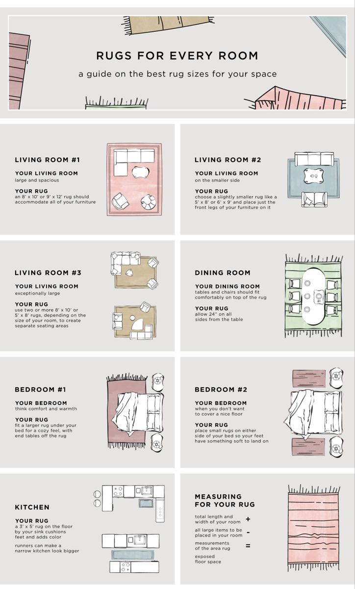
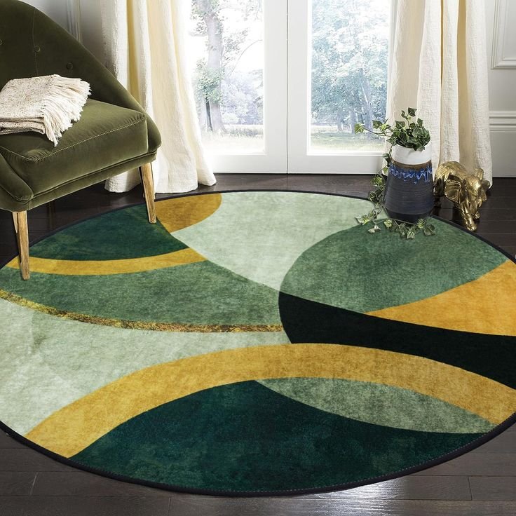
Master how to coordinate area rugs with wallcoverings using this definitive 5-step guide to achieve perfect cohesion. Learn to expertly balance color, scale, and texture to create stunning wallcovering and rug pairings for any room. By following the 80/20 rule, you can confidently match your wall treatment and floor covering, transforming disparate elements into sophisticated visual harmony.
You’ve discovered that dream wallcovering. It might be a bold geometric motif, a soothing botanical print, or a classic textured design. Simultaneously, you’ve fallen in love with a beautiful rug—plush, soft, and perfectly sized for your space.
Now comes the pivotal moment: How do you pair your area rug with your wallcovering so that your room looks cohesive, intentional, and perfectly put-together, rather than messy or overwhelming?
This process transcends simple color matching; it’s about establishing visual harmony through thoughtful consideration of scale, texture, and contrast. When executed correctly, the combination of your wallcovering and floor rug can transform a plain area into a stunning, layered, and sophisticated sanctuary.
Here is your detailed, 5-step process to master the art of wallcovering and rug coordination for the living room and every other space in your home.
Step 1: Determine the Dominant Element (The 80/20 Rule)
Before you begin blending colors and patterns, you must decide which element—the wallcovering or the rug—will serve as the focal point (the dominant pattern) and which will be the supporting feature (the quiet foundation). This decision is critical for achieving balance and avoiding a visually chaotic room.
- Option A: The Bold Wallcovering (The 80%)
- If your wallcovering features a large-scale, detailed pattern (e.g., a tropical mural, an intense floral, or a dramatic geometric), the walls are the main focus.
- The Rug’s Role: The rug must act as a grounding element. Look for solid colors, subtle texture, or simple, small-scale patterns (like a thin stripe or a solid border).
- The Goal: The rug should intentionally complement one or two secondary colors found within the busy wallcovering pattern. This links the floor to the walls without competing for attention.
- Option B: The Bold Rug (The 80%)
- If your rug is a vibrant Persian, a busy geometric, or a design with intense, high-contrast colors, it is the hero piece. This might be a gorgeous antique-style rug or an elaborate hand-knotted textile.
- The Wallcovering’s Role: Choose a calming, low-key backdrop. Opt for textured wall finishes (like grasscloth or linen), a solid paint color, or a very muted, tiny print (like a subtle ticking stripe or a light trellis pattern).
- The Goal: The walls provide a soft canvas that allows the rug’s colors and patterns to truly pop.
Key Takeaway: Never pair two bold, dominant patterns of the same scale. One element must be visually striking, and the other must be reserved. This principle is vital for successfully coordinating your décor.
Step 2: Master the Color Connection (The “Pull-Out” Method)
This step is where you make the deliberate color choices that ensure a cohesive final look. You want your pairing of floor covering with wall treatment to appear intentional, not accidental.
Identify Your Core Palette
Look closely at your dominant element (from Step 1). Identify the three main colors:
- Primary Color: The most dominant shade (e.g., the navy blue background of the wallcovering).
- Secondary Color: A medium amount of a secondary shade (e.g., the white or gold within the pattern).
- Accent Color: A small splash of contrasting color (e.g., a tiny bit of deep red or green).
Connect the Floor to the Walls
Your secondary element (the rug or wallcovering) should primarily incorporate the Primary Color or Secondary Color from the dominant piece.
- Example: If your bold wallcovering has a primary navy background and a secondary gold print, your simpler rug should be a solid gold or a tone-on-tone navy.
- Avoid: Don’t let the rug feature only the Accent Color unless you are using a very small accent rug. The main area rug is too large to carry only the accent color without looking disconnected.
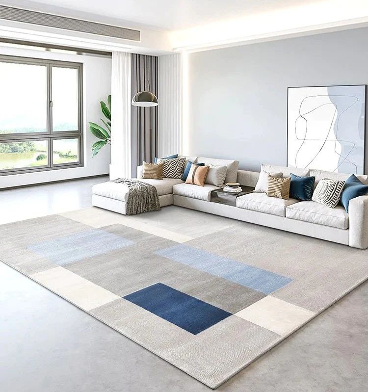
Consider Contrast
Color contrast adds depth and visual interest. If your rug is a light shade (cream, ivory, pale gray), your wall treatment can be dark and dramatic (charcoal, forest green). Conversely, if your walls are bright and colorful, a muted or neutral area rug helps to ground the room and prevent visual overload.
Step 3: Integrate Texture and Material (The Sensory Layer)
While color captures immediate attention, texture adds complexity and sophistication. Successfully pairing a wallcovering with a rug means considering how the materials feel and look together.
Wallcovering Textures
- Smooth/Slick: Simple paper wallcoverings often look best with plush, high-pile, or textured rugs (shag, thick wool).
- Textured/Natural: Grasscloth, woven fibers, or linen wallcoverings are naturally textured. These pair beautifully with flatter, less imposing rugs like jute, sisal, or a low-pile hand-knotted rug to balance the inherent roughness.
- Metallic/Sheen: If your wallcovering has a shimmer, balance it with a matte finish on the floor, like flat cotton or thick wool, to prevent the room from looking too garish.
Rug Textures
- Shag/Fluffy: These add warmth and softness. They complement simple, smooth wallcoverings.
- Woven/Flatweave: Kilim or dhurrie rugs are inherently casual. They work well with bold, colorful wallcoverings that match their relaxed energy.
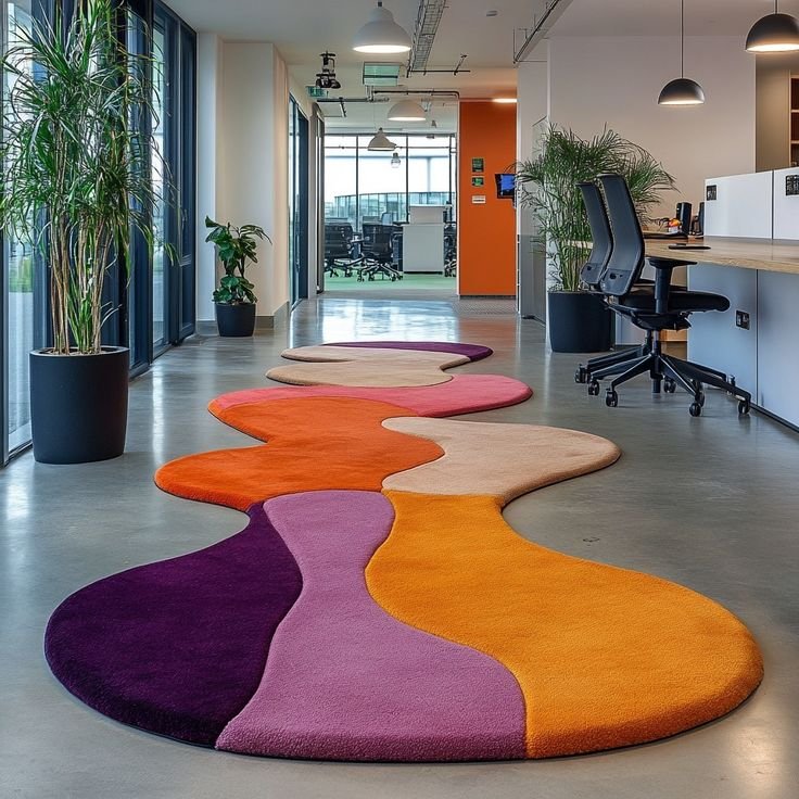
- Silky/Viscose: Rugs with a sheen, such as silk-blend rugs or viscose materials, convey luxury. Pair them with sophisticated, subtle wallcoverings, such as tone-on-tone damasks or finely textured linens. If you invest in a custom-made textile, ensure the texture complements the wall material.
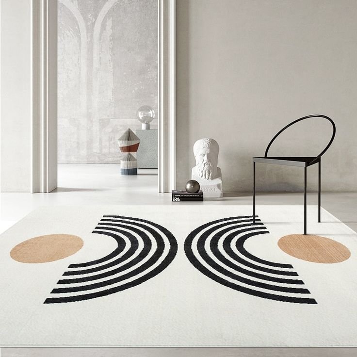
Step 4: Determine Scale and Pattern Density
This is arguably the most critical step for achieving a professional, balanced look. The key is Variety in Scale.
Imagine you have two bowls of visual elements:
- Scenario A: Blending Small and Large
- Wallcovering: Features a large-scale pattern (big flowers, wide stripes, large geometric shapes).
- Rug: Should have a small-scale pattern (a subtle diamond trellis, tiny polka dots, or thin stripes) OR be completely solid. This could be a subtly patterned hand-tufted floor covering.
- Result: The large wallcovering dominates, and the small-patterned rug provides a pleasant, subtle layer without competing.
- Scenario B: Blending Busy and Simple
- Wallcovering: Features a small, dense, repetitive pattern (like a tightly packed print or tiny all-over motif).
- Rug: Should have a large, open, and simple pattern (like a few expansive color blocks or a wide border design) OR be completely solid.
- Result: The walls provide a visual buzz, and the rug creates breathing room, making the overall look balanced. This combination is often seen in high-end spaces featuring designer rugs.

Expert Tip for Pattern Anxiety: If you are nervous about combining two patterns, stick to one patterned item and one textured solid. For example, a patterned wallcovering and a solid area rug with a high-low pile.
Step 5: Test the Cohesion in Your Lighting
A rug that looked perfect under the store’s lights and a wallcovering sample admired in a catalog can look dramatically different when brought together in your home’s natural and artificial light.
Bring Samples Together
The best way to ensure successful rug styling with a wallcovering is to place your rug sample directly against a large wallcovering sample (or, ideally, against the already installed wallcovering).
Check the Light Cycle
Observe the pairing at different times:
- Daylight: Does the natural light make the rug’s colors look washed out or too intense compared to the walls?
- Nighttime/Lamp Light: Does the artificial light bring out an unintended undertone (e.g., does the gray in the rug suddenly look blue, clashing with the beige walls)?
This step often reveals subtle differences in tone that can compromise the entire look, saving you from a costly mistake. Adjust your secondary color choice if necessary. This final test ensures your wallcovering and rug pairing ideas look perfect in real-life conditions.
Practical Application: Wallcovering & Rug Pairing Ideas
| Room | Wallcovering Idea (Dominant) | Rug Idea (Supportive) | Why It Works |
| Living Room | Botanical print with bold green leaves and a white background. | Low-pile ivory or beige rug with a thin, simple green border. | The rug pulls out the white background and secondary green accent, grounding the intense wall pattern. |
| Bedroom | Subtle, light blue-grey grasscloth texture. | Large-scale geometric rug in navy and cream. | The wall provides a serene texture, allowing the bold geometric rug to be the striking focal point beneath the bed. |
| Dining Room | Dramatic dark floral mural (large scale). | Solid color rug in a tone pulled from a small flower detail (e.g., deep burgundy or mustard yellow). | The solid color rug prevents visual competition and uses a single color to tie into the dramatic mural. |
By following this 5-step process—determining the hero, connecting the colors, layering the textures, varying the scale, and testing under lighting—you will successfully create a room where your wallcovering and floor covering complement each other perfectly, resulting in sophisticated, effortless cohesion.
FAQs
Should the rug color match the wallcovering color exactly?
No, it’s better to coordinate rather than match exactly. The rug should pull out one or two secondary or accent colors found in the wallcovering pattern. This creates depth and cohesion without appearing too flat or manufactured.
How do I use a patterned rug with a busy patterned wallcovering?
The patterns must be significantly different in scale. If the wallcovering has a small, tight, repetitive pattern, choose a rug with a very large, open, and simple pattern (or vice versa). This ensures they don’t visually compete with each other.
Can I use a traditional antique-style rug with modern geometric wallcovering?
Absolutely! Mixing styles adds interest. The key is color connection. Ensure the rug’s colors (even if muted) match a color in the modern wallcovering to bridge the two styles seamlessly.
Is grasscloth wallcovering considered a pattern or a texture?
Grasscloth is primarily considered a texture. Its subtle, woven variation is calming and acts as a neutral background, making it an excellent choice to pair with almost any bold, patterned hand-tufted rug or luxury textile.
What is the easiest way to ensure my wallcovering and rug don’t clash?
When in doubt, choose a solid, textured rug (like a neutral wool or jute) that matches the most subtle background color of your wallcovering. This ensures immediate balance and prevents the room from feeling overwhelmingly busy.
Should my rug and wallcovering be the same style (e.g., both farmhouse or both modern)?
Not necessarily. Mixing styles (e.g., a modern geometric rug with a classic floral wallcovering) creates a collected, sophisticated look. Focus on the scale and color connections first; the styles will often harmonize if those elements are balanced.
What is the best approach for wallcovering and rug pairing for the living room?
In the living room, always prioritize the function of the space. If the room is for relaxing, aim for soft textures (shag/wool) and use the 80/20 rule: if your walls are bold, use a simple rug to define the seating area and anchor the furniture.